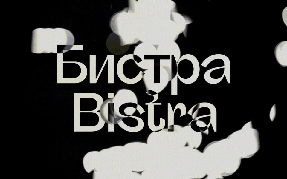
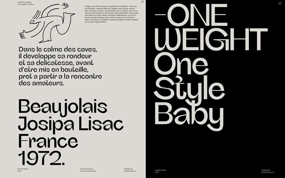
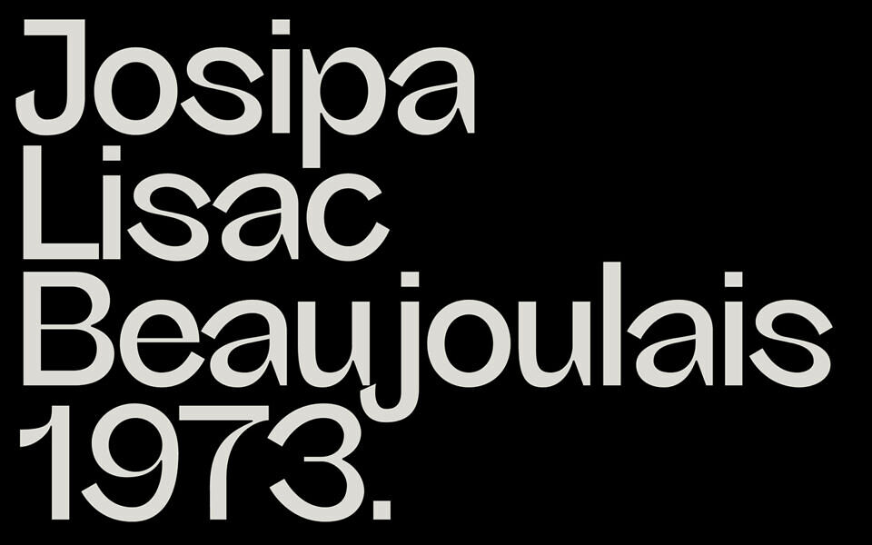
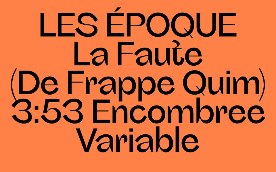
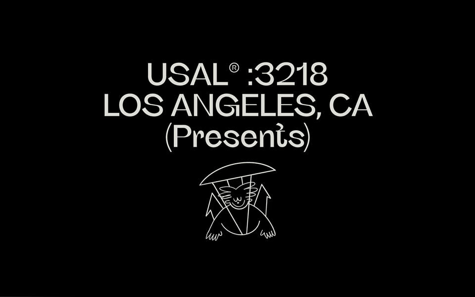
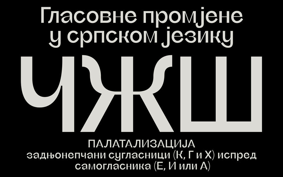
KS Bistra is a semi-grotesque with atypical contrast behavior, combining natural and reverse contrast within a humanist framework. Its construction features subtle ink traps, asymmetric and calligraphic curvature, lending both texture and movement.
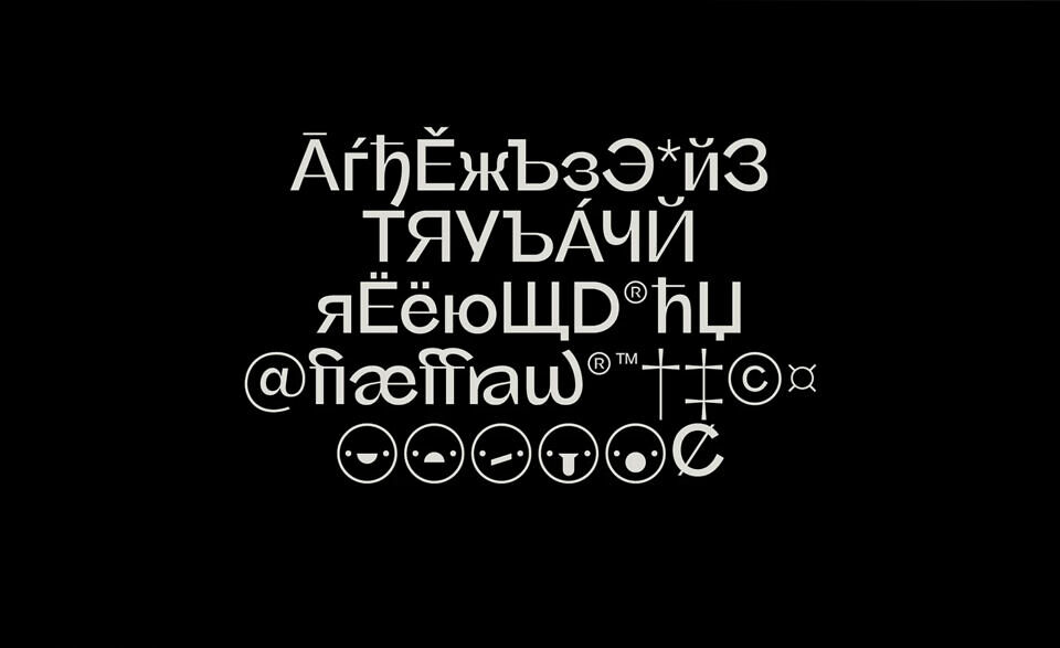
The name- KS Bistra, derived from the Serbian word for “clear” reflects its fluid, river- like morphology. With distinctive forms such as the looped “S” or weird “t,” KS Bistra balances legibility with personality, a grotesque that defies neutrality, designed for distinctive voice in editorial, branding, and mostly display contexts. You can also enhance your designs with selection of ligatures available.
KS Bistra is offered in a single weight and style by design. One cut, done right.
| Font Details | ||
|---|---|---|
Download KS Bistra Font | ||