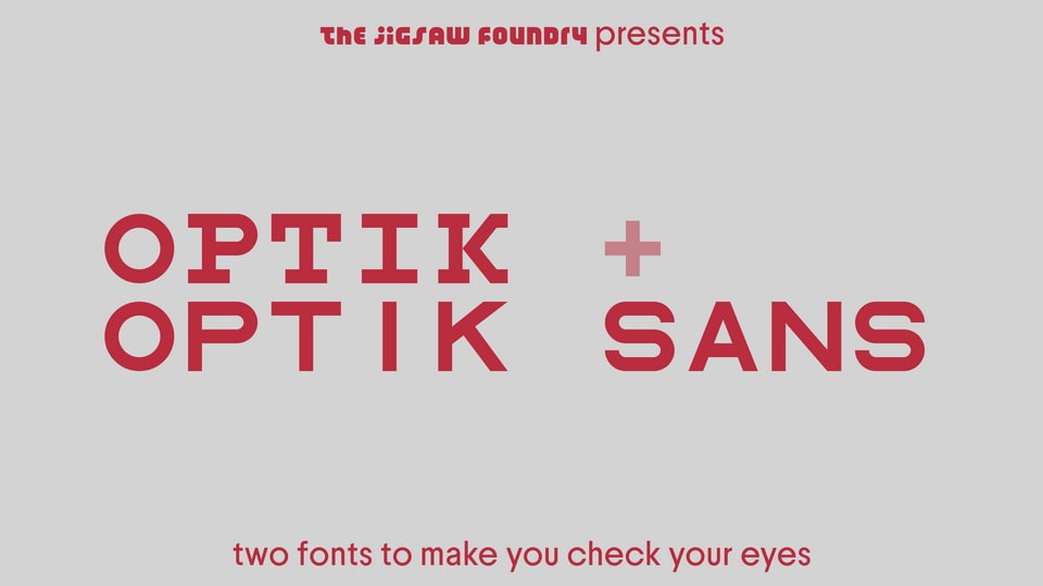
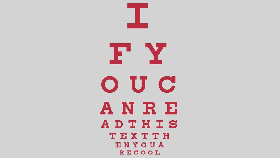
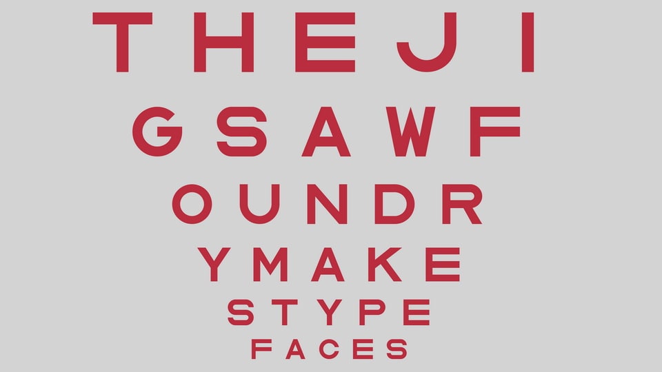
The TJF Optik mini-superfamily is based off of many a trip to the doctor’s for a half-annual checkup. Ya know, when they make you look at the chart and say the letters with one eye open?
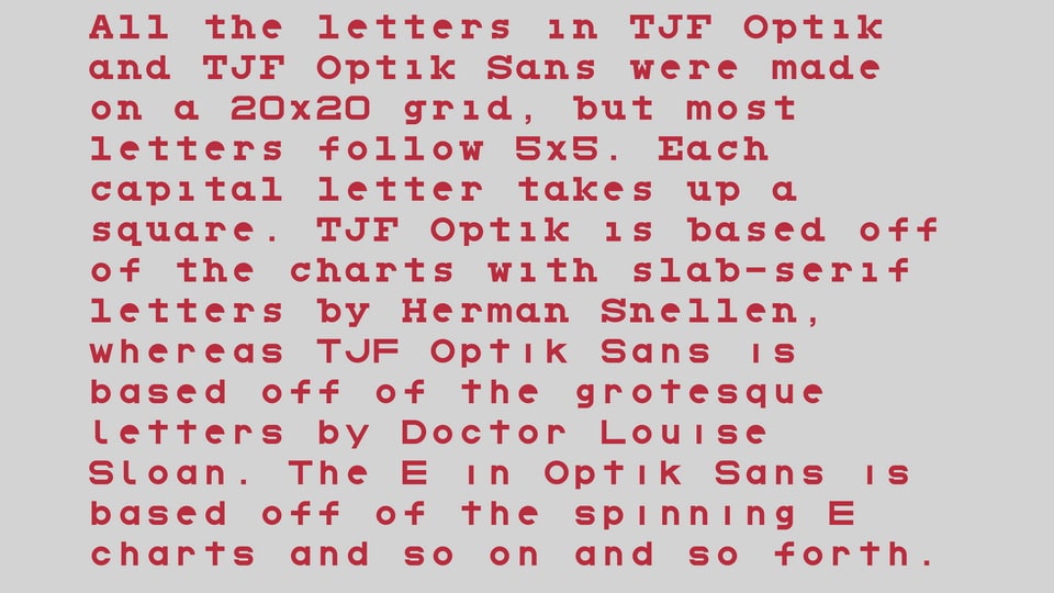
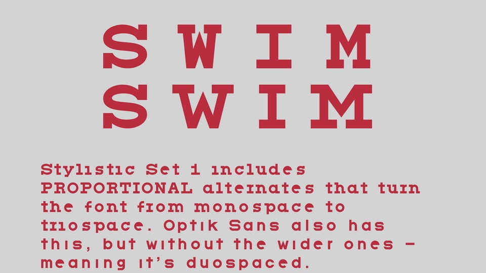
TJF Optik is based off of the charts with slab-serif letters by Herman Snellen, whereas TJF Optik Sans is based off of the charts with grotesque letters by Doctor Louise Sloan. The E in Optik Sans is based off of the spinning E charts and so on and so forth…. All the letters in both fonts were made on a 20×20 grid, but most letters follow 5×5. Each letter takes up a square, but Stylistic Set 1 includes proportional alternates that turn the font from monospace to Triospace. Optik Sans also has this, but without the wider ones – meaning it’s duospaced.
| Font Details | ||
|---|---|---|
| Designed by: The Jigsaw Foundry | ||
You may also like