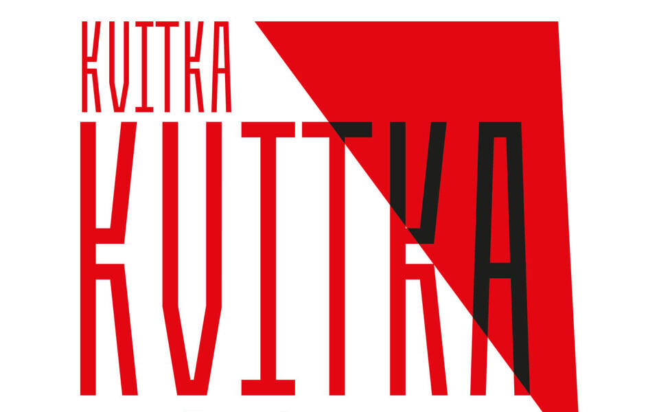

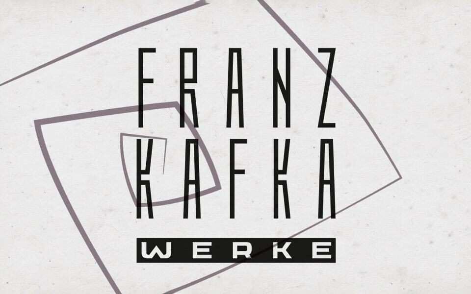
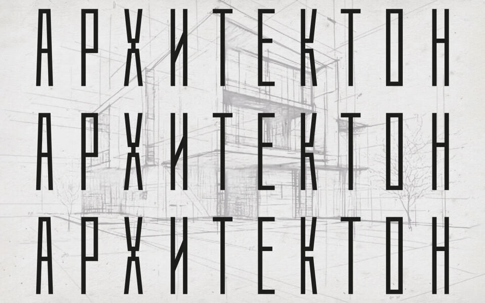
Kvitka SP is a narrow, rigid display typeface with a strong sense of verticality and symmetry, reminiscent of the constructivist experiments of the early 20th century.
It feels like a closed system, a symbol of the bureaucratic labyrinth where the individual dissolves into the structure. Kvitka SP is well-suited for logos, posters, and headlines related to architecture, modernism, philosophy, and the theme of inner alienation.
This font is free for both personal and commercial use but with limited characters. You can get the full version here.
| Font Details | ||
|---|---|---|
Download Kvitka SP Font | ||